head(insurancedata, 3)          # without the pipe: function(data, ...)

insurancedata |> head(3) # with the pipe: data |> function(...)2 Coding a Plot
Build a plot one layer at a time in your web browser
Abstract
This chapter shows researchers what code does before they install any software. Using real insurance data and code cells that run in the web browser (WebR), researchers watch one plot being built one layer at a time with ggplot2’s “grammar of graphics” (data, mapping, geometries, statistics, facets, coordinates, and theme), and they try small changes to see how the output changes. Along the way they meet the two symbols that appear in every chunk of this playbook, the assignment arrow (<-) and the pipe (|>). The chapter ends with how most chapters in this playbook work (The Play, The Lab, Your Turn) and, for later, how to choose one theme for all of your plots and how to save a plot with ggsave().
Keywords
ggplot2, grammar of graphics, layers, theme, WebR
ResourcesResources:
ggplot2
CautionCaution: Be patient, this page is slow to load
The gray code boxes with a Run Code button run R inside your web browser, so you do not need to install anything yet. The first time you open this page, your browser has to download R. That can take 30 to 60 seconds, and longer on campus Wi-Fi. Wait until the status at the top of the page says Ready before you click Run Code. If a box never becomes ready, keep reading: every step also shows the code and the plot it makes.
2.1 Start Here: What Does Code Do?
Code is a set of written instructions. You write a line, R follows it, and you see the result. In this chapter you do not need to understand every word of the code, and you do not need to write any code yourself. Your only job is to notice two things:
- Code builds. Each new line adds something to the plot.
- Small changes matter. Change one word or one number, run it again, and the plot changes.
GoGo: Read the step, look at the plot, then try it
Each step below shows the code and the plot it makes. Under it is a Try it box where you can run the same code yourself and change one thing. You cannot break anything. If you get an error, reload the page and start again.
2.2 Example Data: insurancedata
The example dataset is from the “Medical Cost Personal Costs” database on Kaggle. For this chapter, we refer to it as insurancedata.
2.2.1 What do I do in this chapter?
You will read a little code, run it, and see what it makes. Before the first line of code, you need two words: object and function. Almost every line of R code uses both.
An object is a thing with a name. In R, anything you give a name to is called an object. Think of an object as a labeled box: R puts something inside the box, and from then on you use the name on the label to get it back. In this chapter the box is named insurancedata, and inside it is all of our data: a table with one row for each person and one column for each thing we know about them. A table of data like this is called a dataset. Every time you see the word insurancedata in the code below, it means “use that dataset”.
A function is an action. A function is a command that does one job. You can spot a function because its name is followed by parentheses, like head(). Whatever you put inside the parentheses is what the function works on, called the function’s input. If objects are the nouns of R, functions are the verbs. To see how many verbs R has, skim the R Cheat Sheet: 200 Essential Functions. Each function comes with a one-line description and a short example you can run in your browser. You do not need to learn them now.
head() shows the top of a dataset. The first function in this chapter is head(). It shows the first six rows of a dataset, so you can check what is inside without printing all 1,338 rows. head(insurancedata) means “show me the first six rows of insurancedata”: the function is head(), and the object it works on is insurancedata.
2.2.2 Two symbols you will see in every chunk: <- and |>
<- is the assignment arrow. It puts what is on the right into the object named on the left, and it always points at the name: insurancedata <- read.csv("data/insurance.csv") reads the file and calls the result insurancedata. Read it as “gets”: insurancedata gets the file. Nothing prints when a line assigns; the object simply appears in the environment tab. Typing the name on its own (insurancedata) prints it. In RStudio, Option + - (Mac) or Alt + - (Windows) types <- for you.
|> is the pipe. It hands the result of the left side to the function on the right as its first input, so that steps read left to right, or top to bottom, instead of inside out. These two lines do the same thing:
The pipe earns its keep when there are several steps. Without it you nest functions inside functions and read from the inside out; with it you write one step per line and read down the page. From Pre/Post Data on, most chunks in this playbook are chains like this one, which keeps only the smokers and then shows the first three:
insurancedata |>
  filter(smoker == "yes") |>
  head(3)
Read it as “take insurancedata, then keep the smokers, then show three rows.” Each |> ends a line, and the next line starts with the next step. In RStudio, Cmd + Shift + M (Mac) or Ctrl + Shift + M (Windows) types the pipe. (Tools > Global Options > Code > check Use native pipe operator so that the shortcut gives |> rather than the older %>%.)
One exception you will meet in a moment: ggplot2 joins the layers of a plot with +, not |>. The pipe moves data between steps; the plus adds a layer to a plot.
ResourcesThe older pipe:
%>%
You will see %>% in older books, websites, DataCamp courses, StackOverflow answers, and most code written before 2021. It is the pipe from the magrittr package, which the tidyverse used before R had a pipe of its own. R added |> to the language itself in version 4.1.0 (May 2021), and that is the one this playbook uses. For everything you will do in this course the two behave the same: x %>% f() and x |> f() both mean f(x). Code that uses %>% will run as long as dplyr or tidyverse is loaded, but write |> in your own code so that your report uses one pipe throughout.
Now look at the two kinds of gray boxes you will see in this chapter.
A box with a small clipboard icon in its corner shows code and the result it made when this page was built. The clipboard copies the code so that you can paste it somewhere else, such as your own report. You will not use the clipboard the first time you read this chapter, for Lab 1. For now, you are looking at the code to learn what it does. Later, when you write your RD Report and Final Report, you will come back, click the clipboard, and paste the code into your own file. Here is an example:
head(insurancedata) age sex bmi children smoker region charges
1 19 female 27.900 0 yes southwest 16884.924
2 18 male 33.770 1 no southeast 1725.552
3 28 male 33.000 3 no southeast 4449.462
4 33 male 22.705 0 no northwest 21984.471
5 32 male 28.880 0 no northwest 3866.855
6 31 female 25.740 0 no southeast 3756.622A box with a Run Code button is live. When you click the button, R runs that code inside your browser and shows you the result underneath. Try it now. Wait until the status at the top of the page says Ready, then click Run Code. You should see the same first six people in the dataset.
That is all you do in this chapter: read the code, click Run Code, and watch what the code makes.
2.2.3 Load and Import
These two lines import the data and load the ggplot2 package. Think of R as a new phone and a package as an app. A new phone can do a few things by itself, and apps add everything else. In the same way, R can do basic math and statistics, and ggplot2 is the app that adds plots. You install an app once, and you open it every time you want to use it. library(ggplot2) is how you open the app.
insurancedata <- read.csv("data/insurance.csv")library(ggplot2)2.2.4 Look at the data
Each row is one participant. Each column is one variable, such as age, smoker, and charges (the participant’s medical costs). This time head() has two inputs, separated by a comma: the dataset, and the number 10, which tells head() to show ten rows instead of six.
head(insurancedata, 10) age sex bmi children smoker region charges
1 19 female 27.900 0 yes southwest 16884.924
2 18 male 33.770 1 no southeast 1725.552
3 28 male 33.000 3 no southeast 4449.462
4 33 male 22.705 0 no northwest 21984.471
5 32 male 28.880 0 no northwest 3866.855
6 31 female 25.740 0 no southeast 3756.622
7 46 female 33.440 1 no southeast 8240.590
8 37 female 27.740 3 no northwest 7281.506
9 37 male 29.830 2 no northeast 6406.411
10 60 female 25.840 0 no northwest 28923.1372.3 How do I visualize data in R?
The ggplot2 packages uses seven layers to produce plots/figures for your paper and team poster:
Data: The dataset you’re visualizing
Mapping: Which variables go on which axes (aesthetics)
Geometries: The type of plot (points, lines, bars, etc.)
Facets: Subplots based on categorical variables
Statistics: Statistical transformations of the data
Coordinates: The coordinate system (usually Cartesian)
Theme: Visual styling and appearance

2.4 Color-Coded Learning Guide
In this chapter, headings are color-coded to match the ggplot2 layers:
📊 Data: The dataset🗺️ Mapping: Which variables go where📍 Geometries: Points, bars, lines📏 Scales/Statistics: Axes, calculations🔲 Facets: Separate panels📐 Coordinates: Coordinate system🎨 Theme: Visual appearanceWatch for these colors as you build plots step-by-step! 🎨
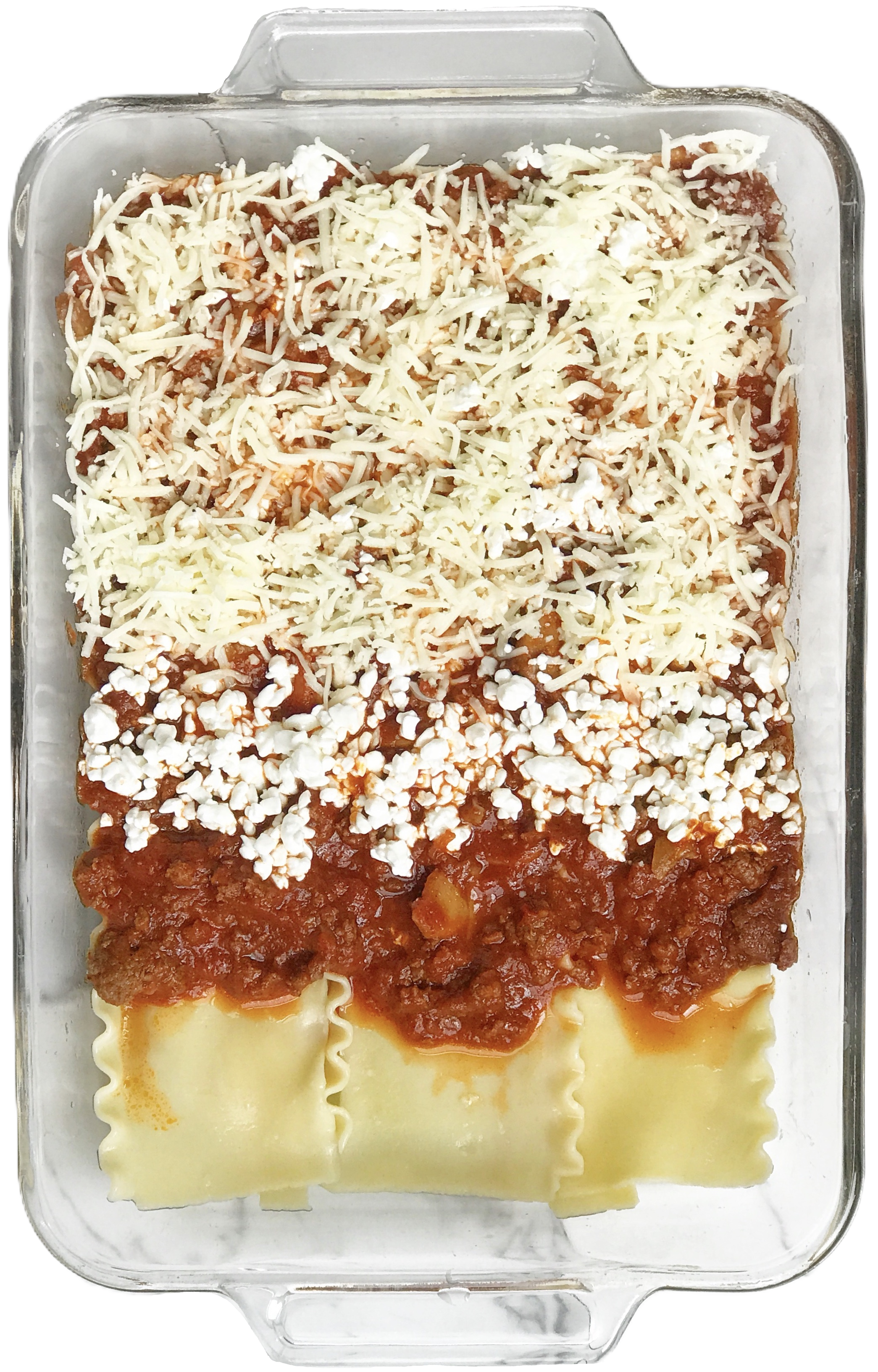
In summary, researchers construct a plot using ggplot2 components in the same way a chef constructs lasagna in layers, one steps at a time.
2.5 Build One Plot, One Layer at a Time
In this section you build one plot, a histogram, one layer at a time.
What is a histogram? A histogram shows how the values of one continuous variable are spread out. A continuous variable is a number that can take many values along a scale, such as age, income, or medical charges. To draw a histogram, R does three things:
- It splits the range of the variable into equal slices, called bins (for example, charges from $0 to $2,000, from $2,000 to $4,000, and so on).
- It counts how many participants fall into each bin. That count is called the frequency.
- It draws one bar per bin. The bar’s position on the x axis shows the range of values, and the bar’s height on the y axis shows the frequency.
So you only tell R which variable goes on the x axis. The y axis is always the frequency, and R counts it for you.
How to read one. Tall bars are values that many participants have. Short bars are values that few participants have. Look at the shape: where the tallest bars are (the most common values), how wide the bars spread (the range), and whether one side stretches out farther than the other (a tail). A histogram looks a lot like a bar chart, but a bar chart counts categories (such as smokers and non-smokers) and has gaps between its bars. A histogram counts ranges of numbers, so its bars touch.
You will use histograms again to describe your own data and to check whether a variable is normal (see Describe Your Data). Watch how each line of code below adds one layer.
Step 1: Set up data
ggplot(data = insurancedata)
You get an empty gray box. R knows which data to use, but not what to draw.
Try it. Click Run Code. You should see the same empty box.
Step 2: Set up mapping
A histogram needs only one variable, on the x axis.
ggplot(data = insurancedata,
       mapping = aes(x = charges))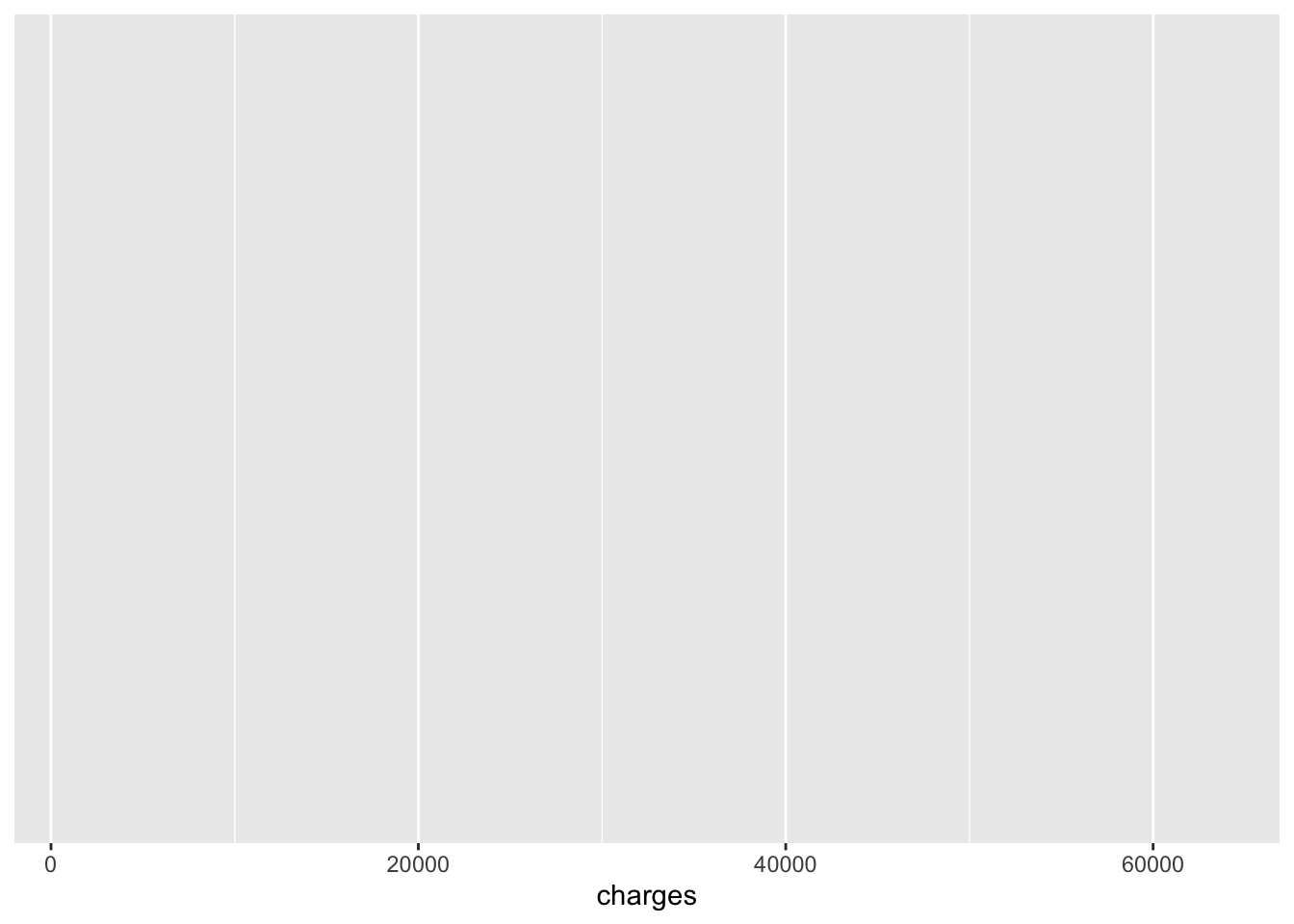
Now the x axis has numbers, because R knows that charges goes there. There is still nothing drawn.
Try it. Run the code. Then change charges to age and run it again. What changed on the x axis? aes(x = ...) tells R which variable goes on the x axis, so the numbers along the bottom change from dollar amounts (charges run from about 1,000 to 64,000) to years (age runs from 18 to 64). The label under the axis changes too. Everything else stays the same, because you have not changed the data or added anything to draw.
CautionCaution: Close every
( with a )
Every opening parenthesis ( needs a closing ). Look at the code above: ggplot( opens on the first line, aes( opens on the second, and the line ends with )), one ) for each. If you leave a ( hanging without its ), R waits for the rest of the command and shows a + in the Console instead of the > prompt. Nothing runs until you close it. When that happens, click in the Console, press Esc, add the missing ), and run the code again. Before you run a code block, count the ( and the ): the numbers must match.
Step 3: Add geometry (bars)
ggplot(data = insurancedata,
       mapping = aes(x = charges)) +
  geom_histogram(bins = 30)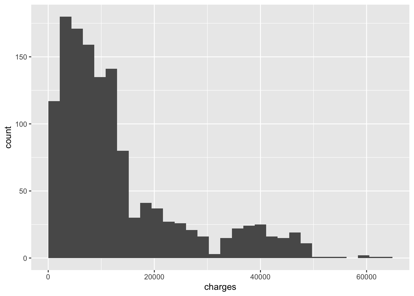
One more line, and the bars appear. The + at the end of a line means “and then add this”. Notice that the code never mentions the y axis: geom_histogram() counts the participants in each bin and puts that frequency on the y axis for you.
Read the plot. The tallest bars are on the left: most participants have low charges (about 3 in 4 have charges under $15,000). A few bars stretch far to the right, out past $40,000. That long stretch on one side is called a right tail, and it means a small number of participants have very high charges. A histogram with a long tail on one side is called skewed.
Try it. Run the code. Then change 30 to 5, and then to 100. Same data, same plot type, a very different picture. bins is the number of bars: R splits the x axis into that many equal-width slices and counts how many people fall in each one. With bins = 5, each bar covers a wide range of charges, so the plot is smooth but hides detail. With bins = 100, each bar covers a narrow range, so you see every bump and gap, including some that are only noise. There is no single right number. Try a few and pick one that shows the shape without the noise.
CautionCaution: Don’t start a line with
+
Layers are joined with a + at the end of a line. If a line starts with +, R runs the plot without that layer and then gives you an error. Look at the code above: the + comes at the end of the line, right before geom_histogram().
Step 4: Add labels and a theme
The plot works, but its axes still show the raw names charges and count. Now add a title and axis labels that a reader of your report will understand. The y axis label describes the frequency that R counted, so it always says what was counted, such as “Number of Participants”. You do not need y = anywhere in the code; a histogram’s y axis is always the frequency.
plot1_charges_histogram <- ggplot(data = insurancedata,
       mapping = aes(x = charges)) +
  geom_histogram(bins = 30, fill = "#005a43", color = "white") +
  ggtitle("Distribution of Insurance Charges") +
  xlab("Insurance Charges") +
  ylab("Number of People") +
  theme_bw()

plot1_charges_histogram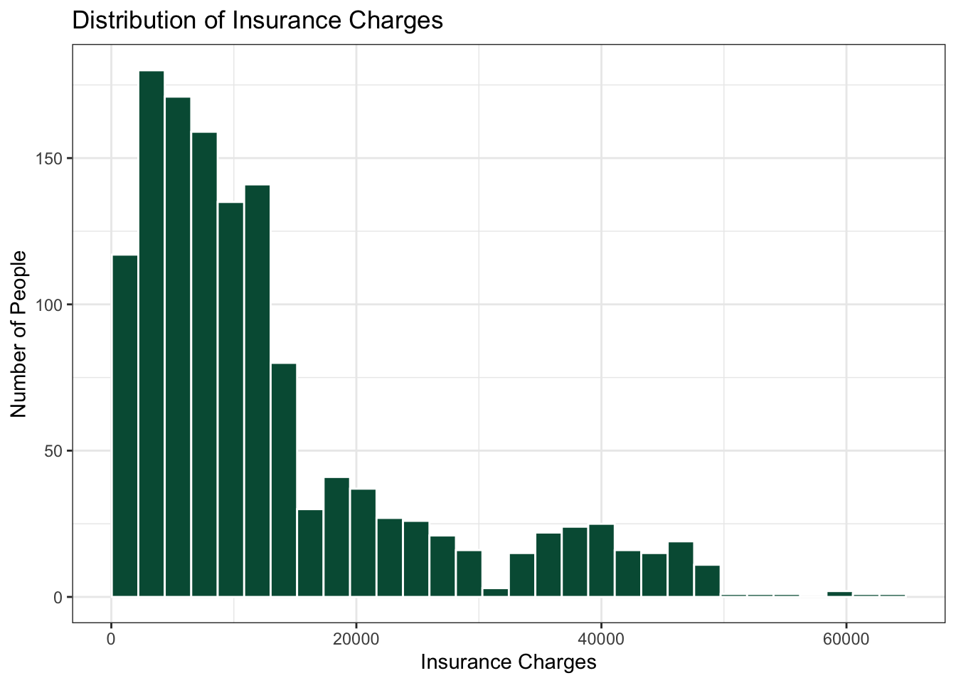
Try it. Run the code. Then change "#005a43" to "purple". fill is the color inside each bar, and color is the color of the bar’s outline, which is why the bars have thin white edges. "#005a43" is a hex code for Binghamton green; "purple" is one of the color names R already knows. Next, change the text inside xlab("...") and run again: xlab() and ylab() set the axis labels, and ggtitle() sets the title above the plot. Finally, change theme_bw() to theme_minimal(): a theme controls everything that is not data, such as the background color and gridlines. Then delete the + at the end of one line and run it. You will get an error. That is normal: put the + back and run it again.
CautionCaution: Saving a plot does not show it
plot1_charges_histogram <- ggplot(...) saves the plot as an object in your environment. To see it, type the object’s name on its own line (or use print()), like the last line of the code above.
Step 5: Find the foul
When code does not work, most people’s first move is to change everything: rewrite the plot, copy new code from somewhere else, or start over. Don’t. The problem is usually one small character: a missing ), a missing ", a missing comma or +, or a capital letter where there should not be one. Look for the small mistake first. Big changes can add new problems on top of the one you had.
GoGo: Look small before you change anything
- Read the error message. It names a line or a word. Start there, and then look at the line just above it, because the mistake is often one line earlier than R says.
- Count the
(and the). The numbers must match. - Check every
". Text such as"Insurance Charges"needs a quote at both ends. - Check the end of each line. Every layer except the last one ends with
+. - Check the spelling and the capital letters.
Chargesis notcharges. - Fix one thing and run the code again. R reports only the first problem it finds, so a new error after a fix often means you are getting closer.
Try it. The code below is the plot from Step 4 with two small mistakes in it. Run it and read the error. Then find and fix both mistakes without rewriting anything else. You are done when the green histogram appears. (If the Run Code box never loads, you can still find both mistakes by reading.)
ResourcesAnswer: the two fouls
Foul 1: a missing " on line 5. xlab("Insurance Charges) + opens the text with " but never closes it, so R reads everything up to the next " as one long label. The error points at line 6 (something like unexpected symbol), but the mistake is on line 5. The fix: xlab("Insurance Charges") +.
Foul 2: a missing ) on line 2. aes(x = charges) closes aes(, but nothing closes ggplot(. After you fix Foul 1, R reaches the end of the code still waiting for that ) and says something like unexpected end of input. The fix: mapping = aes(x = charges)) +, with two ), just like Step 4.
The fixed code:
ggplot(data = insurancedata,
       mapping = aes(x = charges)) +
  geom_histogram(bins = 30, fill = "#005a43", color = "white") +
  ggtitle("Distribution of Insurance Charges") +
  xlab("Insurance Charges") +
  ylab("Number of People") +
  theme_bw()
Two characters fixed, nothing rewritten. That is how most broken code gets fixed.
2.6 What You Just Learned About Code
- Code runs from top to bottom, one line at a time.
- Each line adds one thing. You built a plot in four steps: data, mapping, bars, then labels and a theme.
- Small changes give different results. One number changed the whole shape of the histogram.
- Errors are normal, and they can be fixed. A missing
+broke the plot, and putting it back fixed it.
That is how all of the code in this playbook works, not only plots.
2.7 How Most Chapters Work
You just watched a play and tried it in your browser. From here on, most chapters that use data give you three passes:
- The Play. You watch: the chapter walks through the code with an example dataset, as this chapter did.
- The Lab. You practice in RStudio with the lab dataset that everyone shares. Labs are not graded. Ref the Raccoon, the referee of this playbook, shows you the answer you should get, so you can check your own work.
- Your Turn. You run the play with your own team’s data. There is no Ref, but there is a checklist. Your Turn gives you template code in which every word that starts with
SWAPis a placeholder for one of your own variables or files; everything else is real code you keep.
To do The Lab and Your Turn, you need R and RStudio on your own computer. That is the next chapter: R Software.
2.8 Come Back Later: Themes and Colors
Skip the rest of this chapter on your first read. Come back when you are making plots for your RD Report.
2.8.1 Pick One Theme
theme_bw() controls the overall look of the plot. There are several complete themes to choose from.
ImportantRequired for Team Poster: pick one theme for your team
Team members should pick one theme (from the complete themes) to use with all plots in your individual reports and the team poster! This playbook uses theme_bw() in every Play, but that is the playbook’s choice, not a rule for your team: pick the theme your team likes, write it down in your team codebook, and use it in every plot. The complete themes change the background, grid lines, and borders only; they all use the same font, so your choice of theme does not change the font on your poster.
ResourcesResources: colors in
ggplot2