insurancedata <- read.csv("data/insurance.csv")24 Visualize a Relationship
How to build scatterplots to show how two scores go together
Abstract
This chapter teaches researchers to visualize relationship research questions, which examine how two continuous scores go together. In Play 1, using real insurance data, researchers build a scatterplot one layer at a time: data, mapping, points, a line of best fit, grouping with color or facets, labels, a theme, and axis scales. In Play 2, using the Cohort 10 health status data, they put a third variable into the plot with color and shape (self-rated health against subjective social status, by minoritized status and sex) and see when a rating can be treated as a score. In The Lab, researchers make a scatterplot with the lab dataset and then learn what to do when survey scores stack on top of each other: jitter the points and say so in the figure caption. In Your Turn, researchers use a copy-ready template and a checklist to build the relationship plot for their own research question.
Keywords
ggplot2, scatterplot, line of best fit, jitter, relationship
Resources Ref’s kickoff: find the Ref before you code
Ref’s kickoff: find the Ref before you code
Open Project → Open .qmd → Run load-library chunk → Run All Chunks Above → code. If anything looks wrong, use Ref’s Quick Checklist.
ResourcesResources:
ggplot2
24.1 How This Chapter Works
You will go through this chapter three times, with three different datasets.
| Pass | Section | Dataset | What you do |
|---|---|---|---|
| 1 | The Play | insurancedata (example) |
Watch the play. Read the code and the output, step by step. |
| 2 | The Lab | lab dataset | Run the play. Make two scatterplots yourself during the R Lab, then check your own work. Labs are not graded. |
| 3 | Your Turn | your team’s dataset | Call your own play. After you finish all of the R Labs, come back and make the plot for your own research question. |
GoGo: Know your route first
This chapter is the Visualize step on The Analysis Map for a relationship question: two continuous scores. New to ggplot2 layers? Read Coding a Plot first.
24.2 📋 The Play
24.2.1 Example Data: insurancedata
The example dataset is from the “Medical Cost Personal Costs” database on Kaggle. For this chapter, we refer to it as insurancedata.
library(ggplot2)24.2.2 Relationship Research
For relationship research, the variables are 📏 Continuous because they range along a continuum, such as a scale for beliefs from 1 (strongly disagree) to 6 (strongly agree). To examine the relationship between two continous variables, use the steps below to build a custom scatterplot.
STEP-BY-STEP TO BUILD A SCATTERPLOT
Step 1: Set up data
ggplot(data = insurancedata)
Step 2: Set up mapping
What is the relationship between BMI and insurance charges?
ggplot(data = insurancedata,
       mapping = aes(
         x = bmi,
         y = charges))
Resources📊 Layer: Data + Mapping
Two layers are used:
- Data:
insurancedatadataset - Mapping:
aes(x = bmi, y = charges)
Step 3: Add geometry (points)
Add points to create a scatterplot using geom_point():
ggplot(data = insurancedata,
       mapping = aes(
         x = bmi,
         y = charges)) + geom_point()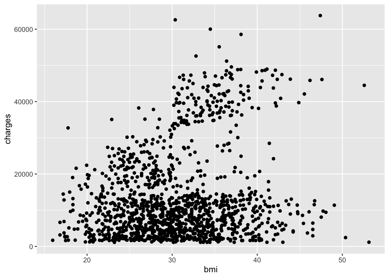
Resources🎨 Layer: Geometries
- Geometry:
geom_point()displays data as points
CautionCaution: Don’t start a line with
+
Layers are joined with a + at the end of a line. If a line starts with +, R runs the plot without that layer and then gives you an error. Look at the code above: the + comes right before geom_point(), on the same line as the layer before it.
Step 4: Add a statistical layer (trend line)
Add a linear model line with geom_smooth():
ggplot(data = insurancedata,
       mapping = aes(
         x = bmi,
         y = charges)) + geom_point() +
  geom_smooth(method = "lm")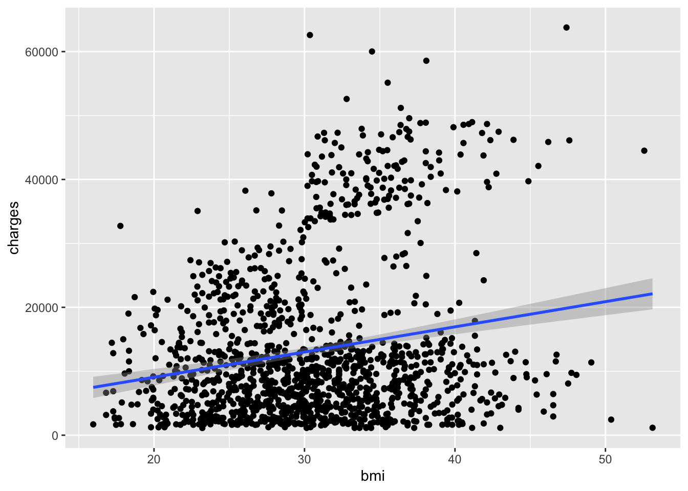
Resources📈 Layer: Statistics
- Statistics:
geom_smooth()calculates and displays a trend line
Notice how it looks like we have two different populations? Let’s explore this further.
Step 5. Incorporate grouping (color)
If you have three variables (2 continouous, 1 categorical/grouping variable), then you can use facets. There are two main approaches to visualizing grouping variables:
Method 1: Using Color
Map the smoker variable to color:
ggplot(data = insurancedata,
       mapping = aes(
         x = bmi,
         y = charges,
         color = smoker)) +
  geom_point() +
  geom_smooth(method = "lm")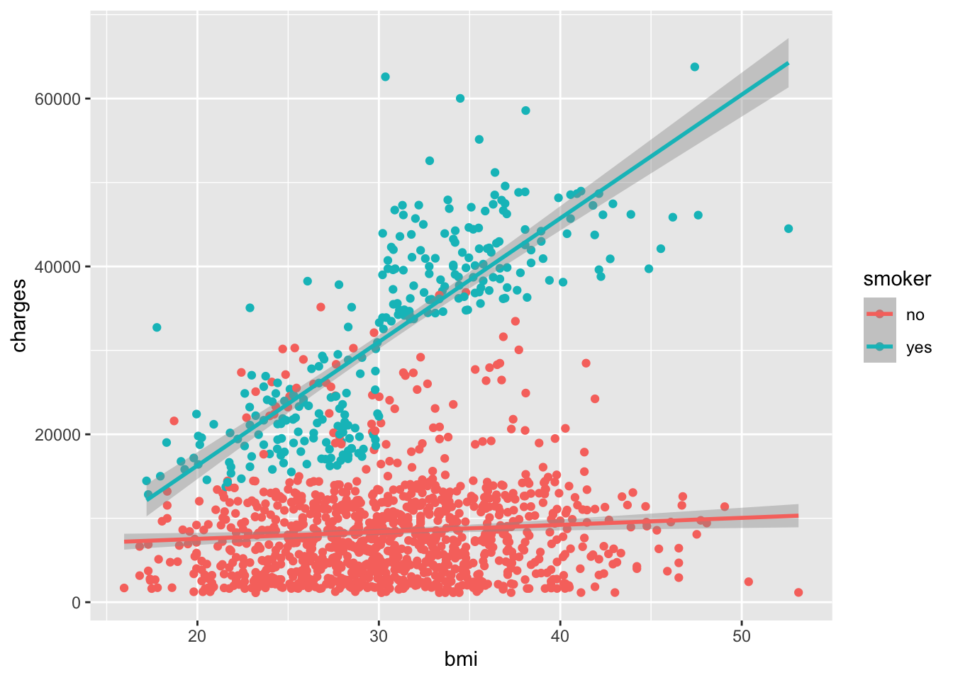
GoGo: Put a variable inside
aes()
color = smoker is inside aes() because smoker is a variable in the dataset. If you want every point to be one color, put the color outside aes(), like this: geom_point(color = "#005a43").
Resources🔵 Layer: Facet (extended)
- Facet: Added
color = smokerto group by smoking status
Method 2: Using Facets
Create separate panels for each group with facet_wrap():
ggplot(data = insurancedata,
       mapping = aes(
         x = bmi,
         y = charges)) +
  geom_point() +
  geom_smooth(method = "lm") +
  facet_wrap(~smoker)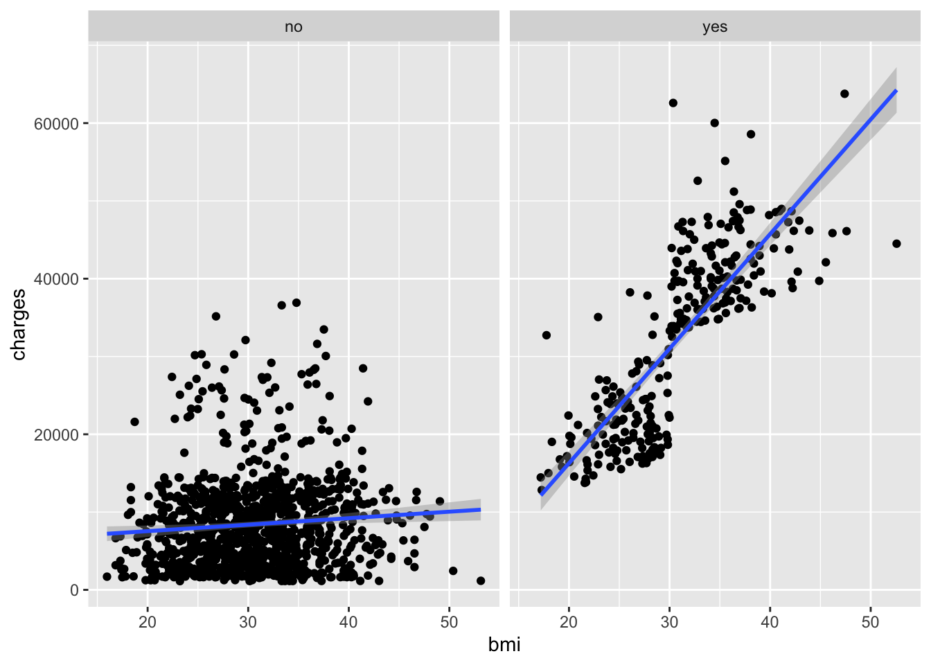
Resources📊 Layer: Facets
- Facets:
facet_wrap(~smoker)creates separate panels
Both methods reveal that smoking status significantly affects the relationship between BMI and insurance charges!
Step 6. Customize Appearance
Adding Titles and Labels
Make your plot more informative with descriptive titles:
ggplot(data = insurancedata,
       mapping = aes(
         x = bmi,
         y = charges)) +
  geom_point() +
  geom_smooth(method = "lm") +
  ggtitle("Insurance charges vs
          BMI for smokers and non-smokers") +
  xlab("Body Mass Index (BMI)") +
  ylab("Insurance Charges")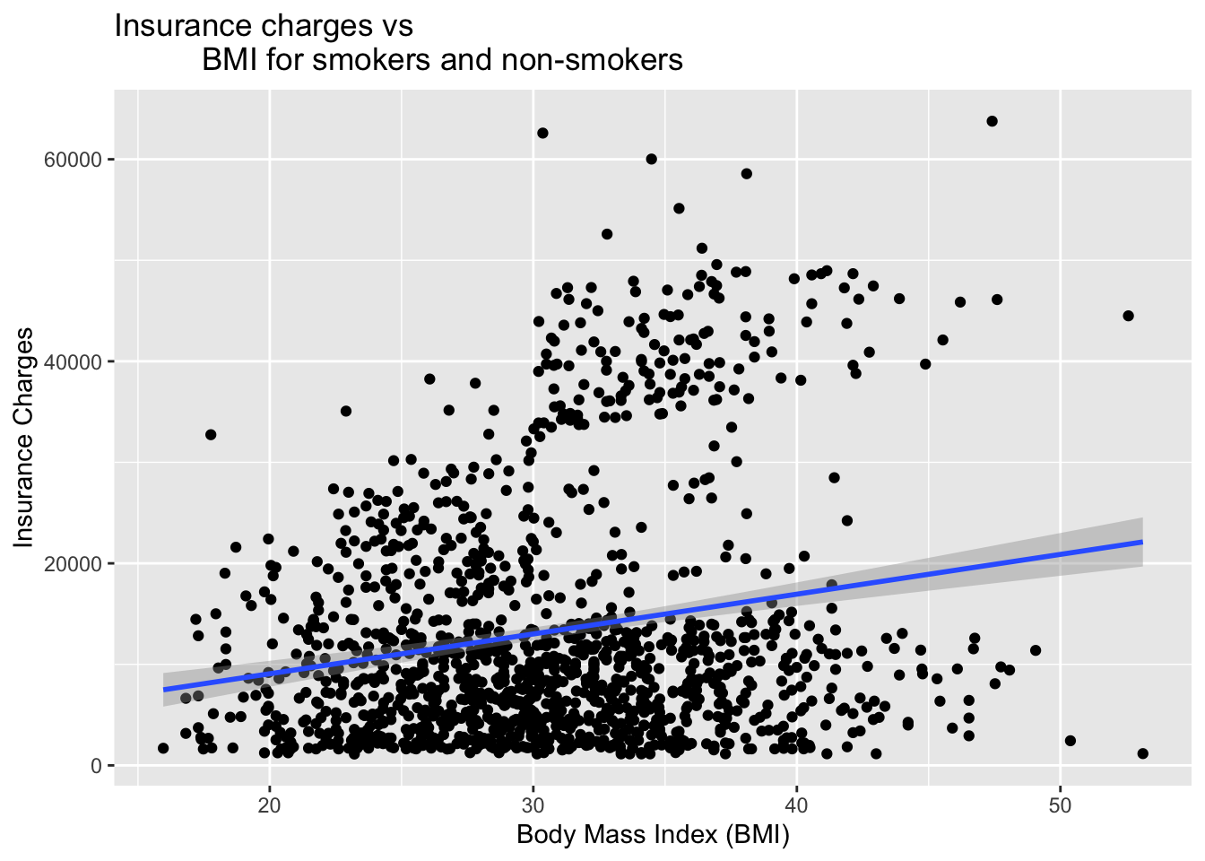
Changing the Theme
Apply a professional theme with theme_bw():
ggplot(data = insurancedata, mapping = aes(x = bmi, y = charges, color = smoker)) +
  geom_point() +
  geom_smooth(method = "lm") +
  ggtitle("Insurance charges vs
          BMI for smokers and non-smokers") +
  xlab("Body Mass Index (BMI)") +
  ylab("Insurance Charges") +
  theme_bw()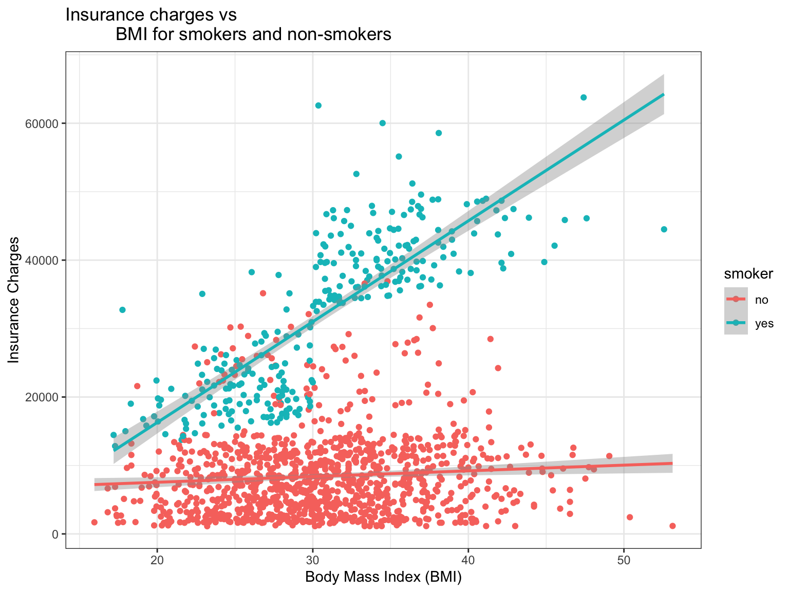
Resources🎨 Layer: Theme
- Theme:
theme_bw()controls the overall visual appearance
ImportantRequired for Team Poster: pick one theme for your team
Team members should pick one theme (from the complete themes) to use with all plots in your individual reports and the team poster!
Adjusting Axis Scales
Sometimes, you need to manually control the range of your axes for better visualization or to match other plots or to capture the entire range of the possible response options (e.g., 1-6, 1-10, 1 - 100).
Set specific limits with xlim() and ylim().
ggplot(data = insurancedata,
       mapping = aes(x = bmi, y = charges, color = smoker)) +
  geom_point() +
  geom_smooth(method = "lm") +
  xlim(15, 55) +  # Set x-axis from 15 to 55
  ylim(0, 65000) +  # Set y-axis from 0 to 65000
  ggtitle("Insurance charges vs BMI for smokers and non-smokers") +
  xlab("Body Mass Index (BMI)") +
  ylab("Insurance Charges") +
  theme_bw()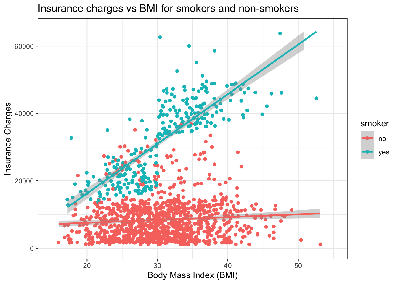
Resources📏 Layer: Scales
- Scales:
xlim()andylim()control axis ranges
CautionCaution: Data outside the limits will be removed
Using xlim() and ylim() removes any data points outside the specified range. This can affect trend lines!
ImportantRequired: x and y axes cover the full scale
If your response options range from 1 to 6. Use ylim( ) to adjust the y-axis to range from 1 to 6 too.
GoGo: Save your plot with
ggsave()
Every plot in your RD Report and Final Report must be saved with ggsave(), so you can add it to your team poster. Save the plot to an object, then add two lines:
ggsave("plots/plot1_wellbeing_support_scatter.png",
       plot = plot1_wellbeing_support_scatter, width = 8, height = 5, dpi = 300)
The file name is the figure number, the variables, and the plot type. The full explanation is in Write the Results.
24.2.3 Play 2: Health status and subjective social status (class dataset)
The insurance data showed the layers. This second play uses a dataset collected by FRI students, and it adds the two things your own relationship plots will need: a third variable that splits the trend line into groups, and a rating scale on the y axis treated as a continuous score.
ResourcesAbout the dataset:
health_status_data.csv (the Cohort 10 class dataset)
Every FRI Public Health team in Cohort 10 asked the same self-rated health question, Would you say your health in general is excellent, very good, good, fair, or poor?, along with the class variables of that year (age, sex, racialized identity, perceived income, and the MacArthur ladder of subjective social status). The five team datasets were merged into one file of 343 respondents so that health status could be examined across the whole class. SAMPLE_ID says which team’s study a person came from.
This is real data, already cleaned and de-identified: no response IDs, passwords, dates, or open-ended answers, and the five team samples differ in whom they recruited (students, families, farmers-market visitors), which is why the chapters filter by age. The variable names predate the class naming rules, so the Play renames them: HEALTH_STATUS becomes HEALTHSTATUS (1 = Poor … 5 = Excellent); SSS is subjective social status (1 to 10); SEX is biological sex (0 = male, 1 = female); and RACIALIZED_IDENTITY (1 = identified as white only, 0 = any other identity) becomes MINORITIZED_01 (1 = minoritized, 0 = not), named for the 1 the way a _01 variable should be. The other columns (RG_…, RI_…, PoorFairHealth, ExcellentHealth) are earlier recodes of the same questions and are not used here.
The question. Is subjective social status (where people place themselves on a 10-rung ladder) related to self-rated health, and does the relationship look the same for people who are minoritized and people who are not? Health status is a 1-to-5 rating. It is ordered and we treat it as a continuous score, the same way the composites in your own data are scores, so that it can be the y axis of a scatterplot, one variable in a correlation (Relate 2 Variables), and the outcome of a regression (Relate 3+ Variables).
library(dplyr)
healthstatusdata <- read.csv("data/health_status_data.csv")

healthstatusdata <- healthstatusdata |>
  rename(HEALTHSTATUS = HEALTH_STATUS) |>
  mutate(
    MINORITIZED_01 = if_else(RACIALIZED_IDENTITY == 1, 0, 1),          # 1 = minoritized (any identity other than white only)
    MINORITIZED    = factor(MINORITIZED_01, levels = c(0, 1), labels = c("Not minoritized", "Minoritized")),
    SEX            = factor(SEX, levels = c(0, 1), labels = c("Male", "Female")))

healthstatusdata_25 <- healthstatusdata |> filter(AGE >= 25)      # adults 25 and older: the teams' student samples skew 18 to 22

nrow(healthstatusdata); nrow(healthstatusdata_25)
[1] 343[1] 122healthstatusdata_25 |> count(SEX, MINORITIZED) SEX MINORITIZED n
1 Male Not minoritized 15
2 Male Minoritized 10
3 Female Not minoritized 75
4 Female Minoritized 22#source: Cohort 10 class dataset (five FRI Public Health teams, merged)
#explanation: rename to the class conventions, make the two grouping factors, and keep respondents 25 and olderThe filter is a choice, and it is reported: with everyone included, the 18-to-22-year-old students dominate the picture and their health ratings barely vary. From 25 up, the ladder and health status have room to move. Say in Methods when you restrict a plot this way, and why.
library(ggplot2)

plot2_health_sss_minoritized_scatter <- ggplot(healthstatusdata_25,
                          aes(x = SSS, y = HEALTHSTATUS)) +
  geom_jitter(aes(color = MINORITIZED, shape = SEX),
              width = 0.15, height = 0.12, size = 2, alpha = 0.7) +   # jitter a little: both variables are whole numbers
  geom_smooth(aes(color = MINORITIZED), method = "lm", se = FALSE, linewidth = 1.3) +
  geom_smooth(method = "lm", se = FALSE, color = "black", linetype = "dashed", linewidth = 1) +
  scale_color_manual(values = c("Not minoritized" = "#2a9d8f", "Minoritized" = "#9b5de5")) +
  scale_x_continuous(breaks = 1:10, limits = c(1, 10)) +
  scale_y_continuous(breaks = 1:5, limits = c(0.8, 5.2),
                     labels = c("Poor", "Fair", "Good", "Very Good", "Excellent")) +
  labs(title = "Self-rated health by subjective social status (age 25+)",
       x = "Subjective social status (1 = bottom rung, 10 = top rung)",
       y = "Health status", color = "Racialized identity", shape = "Sex") +
  theme_bw()

plot2_health_sss_minoritized_scatter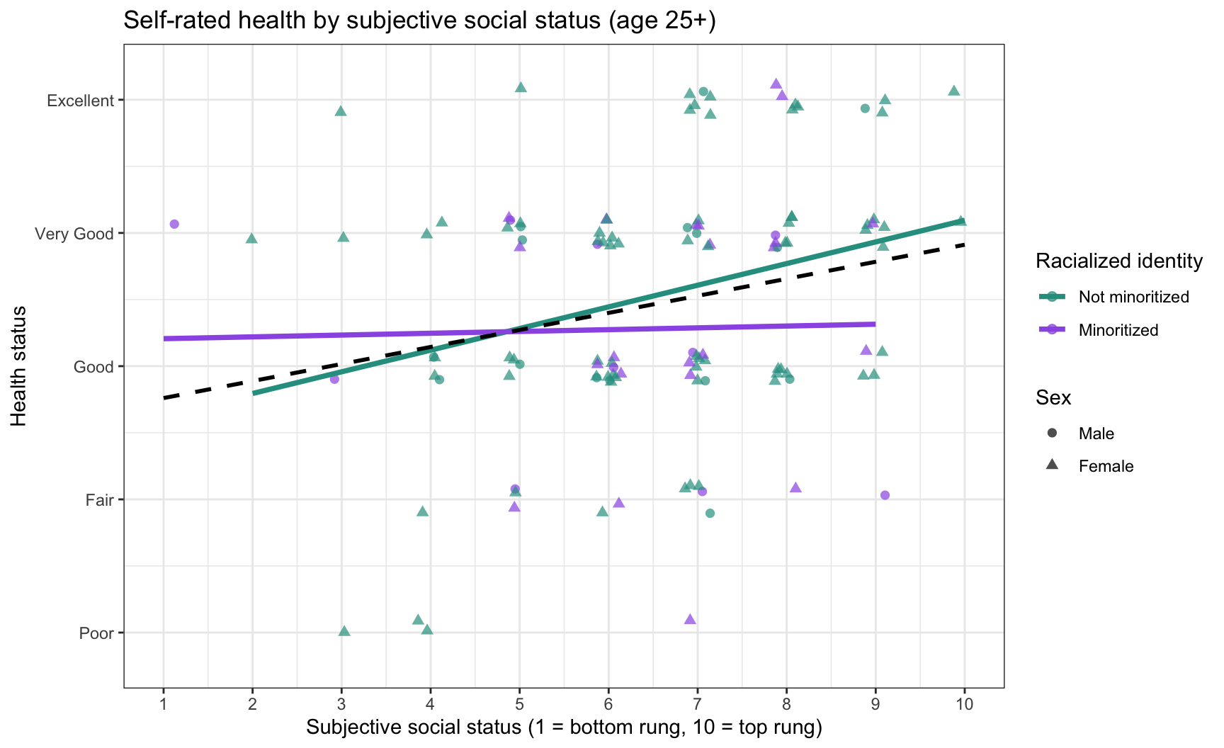
ggsave("plots/plot2_health_sss_minoritized_scatter.png", plot = plot2_health_sss_minoritized_scatter,
       width = 8, height = 5, dpi = 300)

#source: ggplot2 documentation https://ggplot2.tidyverse.org/reference/geom_smooth.html
#explanation: color is the third variable, so geom_smooth() draws one line per group; a second geom_smooth() without a color mapping draws the overall line; the y axis shows the rating labels but the values stay numeric
Read the lines before the points. For respondents who are not minoritized, health rises with social status; for minoritized respondents the line is nearly flat, so a higher rung on the ladder is not matched by better self-rated health. The dashed overall line averages the two and hides that difference, which is the reason to map a third variable at all. Relate 3+ Variables tests whether the two slopes differ (an interaction); here the plot is the question.
GoGo: two ways to put the third variable in
color = MINORITIZED inside aes() gives one line per group on the same panel, which is best for comparing slopes. facet_wrap(~ MINORITIZED) gives one panel per group, which is best when the points would otherwise pile on top of each other. Try both; keep the one where the pattern is easiest to see, and say which groups are being compared in the caption.
CautionCaution: a rating is a score only if you say so
Treating a 1-to-5 health rating as continuous is a standard choice, and a choice: it assumes the steps are roughly equal. Say it in your Methods (“self-rated health was treated as a continuous score from 1 to 5”), keep the y axis on the full 1-to-5 scale (Required), and never average a variable whose numbers are only labels (a _#CAT variable, Transforming Your Data).
24.3 🏈 The Lab
You watched the play above with the insurancedata dataset (Pass 1). Now run two plays yourself with the lab dataset, a survey about what people believe about mental health.
Ref’s kickoff. This lab is not graded, so I am here to help you check your own work. Try each play before you open my check or the solution. If your answer does not match, that is not a penalty. It is how you find out what to fix.
| Lab play | What is new |
|---|---|
| Screen Left | a scatterplot, just like the play above |
| Screen Right | points that stack on top of each other, and how to jitter them |
Before you start
- Open your RStudio Project and your lab
.qmdfile. - Load the clean lab data by running this chunk. It runs the cleaning script you built in the earlier labs.
source("lab_prep.R")   # creates mh_clean
nrow(mh_clean)         # how many people are in the clean dataset?
Go Ref’s check: how many rows?
Ref’s check: how many rows?
nrow(mh_clean) should be 188. If you get 200, you are looking at the raw data: the duplicate response and the people who failed the attention checks have not been removed yet.
24.3.1 Lab Play 1: Screen Left (a scatterplot)
Research question: Is age (AGE) related to the belief that substance use causes mental illness (MIAQ_SUBSTANCE, 1 to 7)?
Your task: Go back to the scatterplot play and rebuild it for this question. Put AGE on the x axis and MIAQ_SUBSTANCE on the y axis, use geom_point(), add a line of best fit, label both axes in plain words, add a title, and use theme_bw().
Go Ref’s check: what should the plot look like?
Ref’s check: what should the plot look like?
- Your plot should include 186 people. R will warn you that it removed 2 rows with missing values (two people typed an impossible age). That warning is expected.
- The line of best fit should slope gently upward, and the dots should be spread widely around it. This is what a weak relationship looks like (r = 0.20). Most relationships in survey research look more like this than like a tight line.
- You can see almost every person as a separate dot, because
AGEcan take many different values.
Resources👀 See the solution
plot3_substance_age_scatter <- ggplot(
  data = mh_clean,
  mapping = aes(
    x = AGE,
    y = MIAQ_SUBSTANCE)) +
  geom_point() +
  geom_smooth(method = "lm") +
  ylim(1, 7) +
  ggtitle("Age and the Belief that Substance Use Causes Mental Illness") +
  xlab("Age (years)") +
  ylab("Substance use as a cause (1 = not important, 7 = very important)") +
  theme_bw()

print(plot3_substance_age_scatter)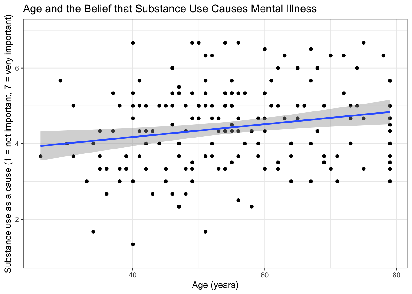
24.3.2 Lab Play 2: Screen Right (a scatterplot with stacked points)
Research question: Is mental health stigma (STIGMA, 1 to 5) related to mental health self-efficacy (EFFICACY, 1 to 6)?
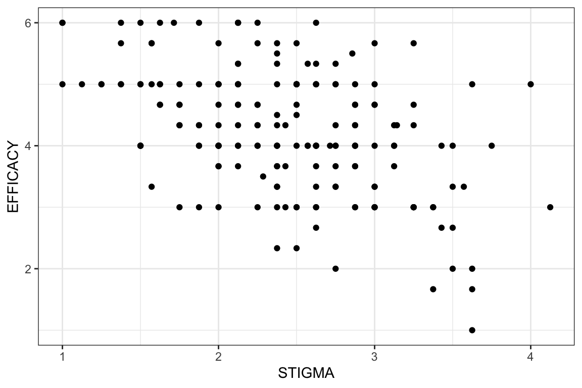
Your task, part 1: Make the same kind of scatterplot as Lab Play 1, with STIGMA on the x axis and EFFICACY on the y axis. Use geom_point(). Then count the dots. Does it look like 188 people?
Caution Foul: stacked points
Foul: stacked points
EFFICACY is the average of three survey items on a 6-point scale, so it can only take a few values (1, 1.33, 1.67, 2, and so on). STIGMA averages eight items, so it has more possible values, but still far fewer than there are people. When two people have the same two scores, geom_point() draws one dot on top of the other, and your plot hides most of your sample. This happens with almost every survey scale, so check for it every time.
Your task, part 2: Fix it. Replace geom_point() with geom_jitter(). Jitter nudges each dot a tiny random distance so that stacked dots separate. Adding alpha = 0.5 makes the dots see-through, so darker areas show where more people are.
geom_jitter(width = 0.08, height = 0.08, alpha = 0.5) +
CautionCaution: Jitter a little, and say that you did
Jitter only moves the dots in the picture. It does not change your data or your line of best fit. Keep width and height small (less than half the distance between two possible scores), and tell your reader in the figure caption that the points are jittered.
Go Ref’s check: how many dots can you see?
Ref’s check: how many dots can you see?
- There are 188 people in this plot, but with
geom_point()you can only see 123 dots. The biggest stack has 5 people on a single dot. - After you switch to
geom_jitter(), you should see small clouds of dots where the single dots used to be. Your dots will not be in exactly the same places as the solution, because jitter is random. That is fine. - The line of best fit should slope downward: people who report more stigma report less self-efficacy (r = -0.47). The line is the same with or without jitter.
Resources👀 See the solution
plot5_efficacy_stigma_scatter <- ggplot(
  data = mh_clean,
  mapping = aes(
    x = STIGMA,
    y = EFFICACY)) +
  geom_jitter(width = 0.08, height = 0.08, alpha = 0.5) +
  geom_smooth(method = "lm") +
  xlim(1, 5) +
  ylim(1, 6) +
  ggtitle("More Stigma, Less Mental Health Self-Efficacy") +
  xlab("Mental health stigma (1 = low, 5 = high)") +
  ylab("Mental health self-efficacy (1 = low, 6 = high)") +
  theme_bw()

print(plot5_efficacy_stigma_scatter)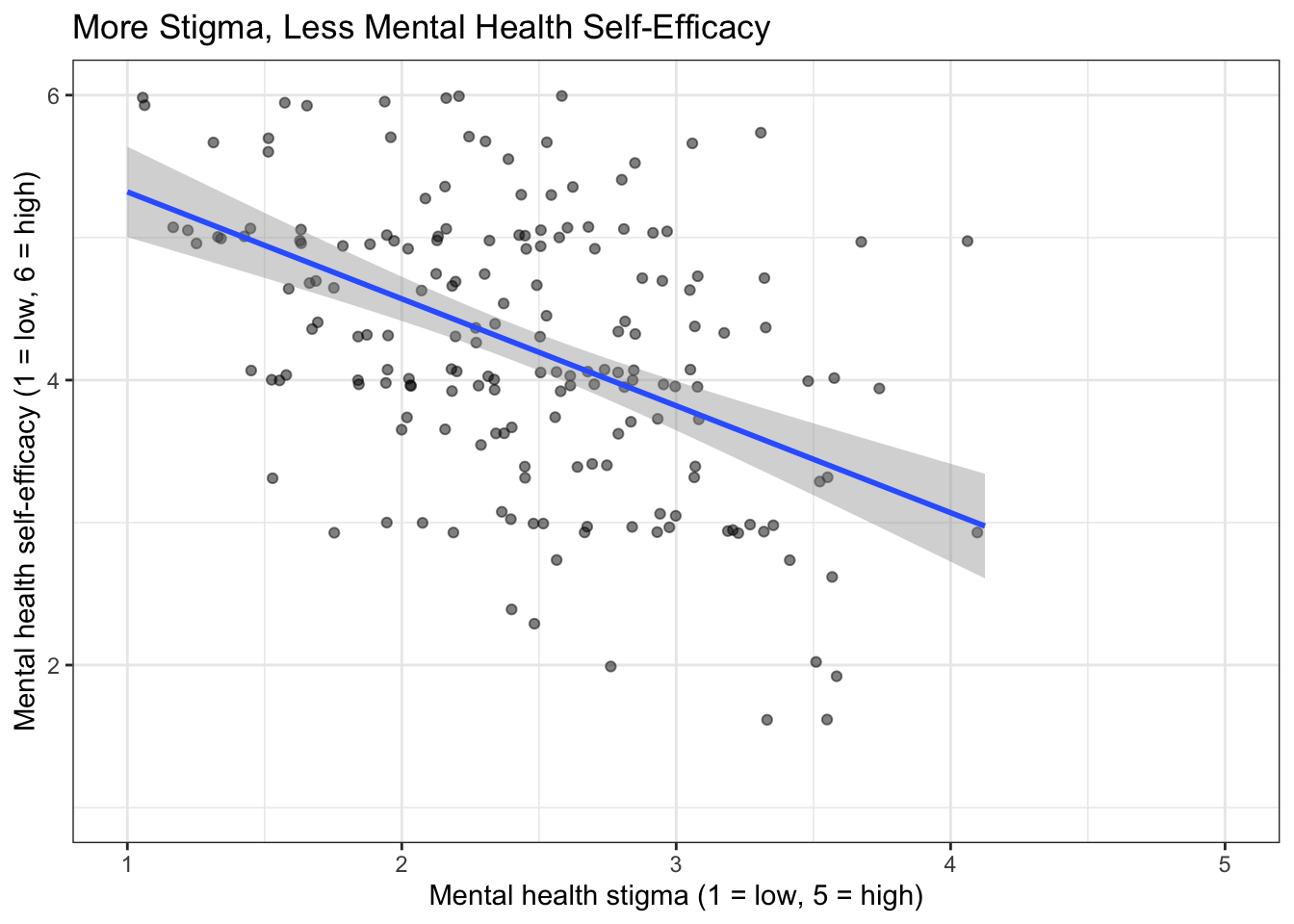
Caution Ref’s call: fouls to check if your plot does not match
Ref’s call: fouls to check if your plot does not match
- Your scatterplot looks like a neat grid of dots → your points are stacked. Use
geom_jitter()(Lab Play 2). - Your jittered plot looks like a shapeless cloud → your jitter is too big. Make
widthandheightsmaller. object 'EFFICACY' not found→EFFICACYandSTIGMAare composites created inlab_prep.R. Runsource("lab_prep.R")first.- An error that mentions
+→ each ggplot line must end with+. A line that starts with+breaks the plot.
Ref’s final whistle. That is the end of the lab. Save your .qmd, render it, and back up your .qmd and .R files to the R Labs folder in your ELN before you quit RStudio.
24.4 🏆 Your Turn
Once you finish all of the R Labs, come back here with your team’s dataset and make the plot for your relationship research question.
24.4.1 The relationship play
plot1_SWAPNAME <- ggplot(                    # SWAP: plot number + variables + plot type
  data = cleandata,                          # alldata = your team's imported .cleandataset (Import Data Once)
  mapping = aes(
    x = SWAPPREDICTOR,                      # SWAP: your predictor
    y = SWAPOUTCOME)) +                     # SWAP: your outcome
  geom_point() +                            # points stacked? use geom_jitter(width = 0.08, height = 0.08, alpha = 0.5)
  geom_smooth(method = "lm") +
  ggtitle("SWAP: your title") +
  xlab("SWAP: a plain-words label and the scale range") +
  ylab("SWAP: a plain-words label and the scale range") +
  theme_bw()                                # use the same theme in every plot

print(plot1_SWAPNAME)
ggsave("plots/plot1_SWAPNAME.png",                # SWAP: the variables and plot type, e.g. plot1_wellbeing_treated_barplot
       plot = plot1_SWAPNAME,
       width = 8, height = 5, dpi = 300)
24.4.2 Checklist for your RD Report and Final Report
ResourcesOpen the plot checklist
| Criteria | Ask yourself |
|---|---|
| Data and mapping | Is the cleaned dataset used, with the correct variables on x and y? |
| Geometry | Is this the best plot for the data (e.g., scatterplot for two continuous variables; barplot or boxplot for groups)? |
| Stacked points | If points sit on top of each other, are they jittered, and does the caption say so? |
| Groups | Were very small groups combined or excluded? Does the caption say what was combined or excluded, with the counts? |
| Stats | Is there a line of best fit on a scatterplot? Are there error bars on a barplot? (Error bars are required in the Final Report, not the RD Report.) |
| Axes and labels | Are both axes labeled in plain words (not variable names)? Does each axis cover the full range of the scale? |
| Facets | Would a facet (one panel per group) help answer your research question? |
| Appearance | Is there an accurate title? Is a non-default theme used (the same theme in every plot)? Does color add meaning? |
| Code formatting | Can you read the code without scrolling to the right? Does the plot print without errors or extra output? |
| Figure caption | Does the chunk have fig-cap, starting with “Figure 1.”, “Figure 2.”, and enough detail to stand alone? |
| Alt text | Does the chunk have fig-alt that describes what the plot shows? |
| ggsave( ) | Is the plot saved with ggsave() into the plots folder of your RStudio Project, named plot#_variables_type.png (for example plot1_wellbeing_treated_barplot.png), with the object named the same? |
| Stands alone | Could a reader understand the figure without reading your text? |
| Referenced in text | Does your results paragraph point to it (e.g., “Figure 1 shows the association between …”)? |
Resources Ref’s final whistle: before you quit RStudio
Ref’s final whistle: before you quit RStudio
Save → Render → Back up to ELN → Quit, Don’t Save workspace. Details: Ref’s Quick Checklist.