insurancedata <- read.csv("data/insurance.csv")20 Visualize a Comparison
How to build barplots and violin plots to compare groups
Abstract
This chapter teaches researchers to visualize comparative research questions, which examine differences in a continuous score between groups. In Play 1, using real insurance data, researchers build a barplot of group means one layer at a time and see a violin plot of the same kind of data. In Play 2, using the Cohort 10 health status data, they add a second grouping variable (a grouped barplot of self-rated health by minoritized status and sex, with error bars) and learn what a bar hides. In The Lab, researchers make a barplot with the original survey groups, then transform the groups (combine small groups, exclude answers that are not groups) to make a clearer barplot, and report what they did in the figure caption. In Your Turn, researchers use copy-ready templates and a checklist to build the comparison plot for their own research question.
Keywords
ggplot2, barplot, violin plot, comparison, case_when, factor
Resources Ref’s kickoff: find the Ref before you code
Ref’s kickoff: find the Ref before you code
Open Project → Open .qmd → Run load-library chunk → Run All Chunks Above → code. If anything looks wrong, use Ref’s Quick Checklist.
ResourcesResources:
ggplot2
20.1 How This Chapter Works
You will go through this chapter three times, with three different datasets.
| Pass | Section | Dataset | What you do |
|---|---|---|---|
| 1 | The Play | insurancedata (example) |
Watch the play. Read the code and the output, step by step. |
| 2 | The Lab | lab dataset | Run the play. Make two barplots yourself during the R Lab, then check your own work. Labs are not graded. |
| 3 | Your Turn | your team’s dataset | Call your own play. After you finish all of the R Labs, come back and make the plot for your own research question. |
GoGo: Know your route first
This chapter is the Visualize step on The Analysis Map for a comparison question: groups (a categorical variable) and one continuous score. New to ggplot2 layers? Read Coding a Plot first.
20.2 📋 The Play
20.2.1 Example Data: insurancedata
The example dataset is from the “Medical Cost Personal Costs” database on Kaggle. For this chapter, we refer to it as insurancedata.
library(ggplot2)20.2.2 Comparative Research
Comparative research questions examine mean score differences on a continuous (quantitative) variable based on real or artificial (researcher-decided) group membership. Simply put, comparative research offers a way of comparing different categories to one another. These categories can be:
🏷️ Nominal Data (Gender Identity)
- Man
- Woman
- Non-Binary
📶 Ordinal Data (Age Group)
- 18 - 35
- 36 - 54
- 55 - 75
- 76+
STEP-BY-STEP TO BUILD A BARPLOT WITH geom_bar()
Bar plots are useful for comparing mean scores across groups.
Step 1: Set up data
ggplot(data = insurancedata)
Step 2: Set up mapping
ggplot(data = insurancedata,
       mapping = aes(
         x = region,
         y = charges))
Resources📊 Layers: Data + Mapping
- Data:
insurancedatadataset - Mapping:
aes(x = region, y = charges)
Step 3: Add geometry (bars)
plot1_charges_region_barplot <- ggplot(
  data = insurancedata,
  mapping = aes(
    x = region,
    y = charges)) +
  geom_bar(stat = 'summary', fun = 'mean')

plot1_charges_region_barplot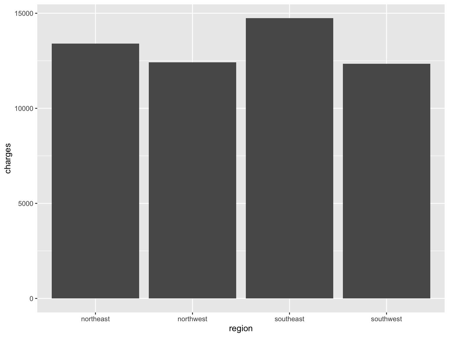
Resources🎨 Layer: Geometries
Geometry:
geom_bar()creates barsStatistics:
stat = 'summary', fun = 'mean'calculates means
CautionCaution: Saving a plot does not show it
plot1_charges_region_barplot <- ggplot(...) saves the plot as an object in your environment. To see it, type the object’s name on its own line (or use print()), like the last line of the code above.
Step 4: Customize bars
plot1_charges_region_barplot <- ggplot(
  data = insurancedata,
  mapping = aes(
    x = region,
    y = charges)) +
  geom_bar(
    stat = 'summary',
    fun = 'mean',
    fill = "#005a43")

plot1_charges_region_barplot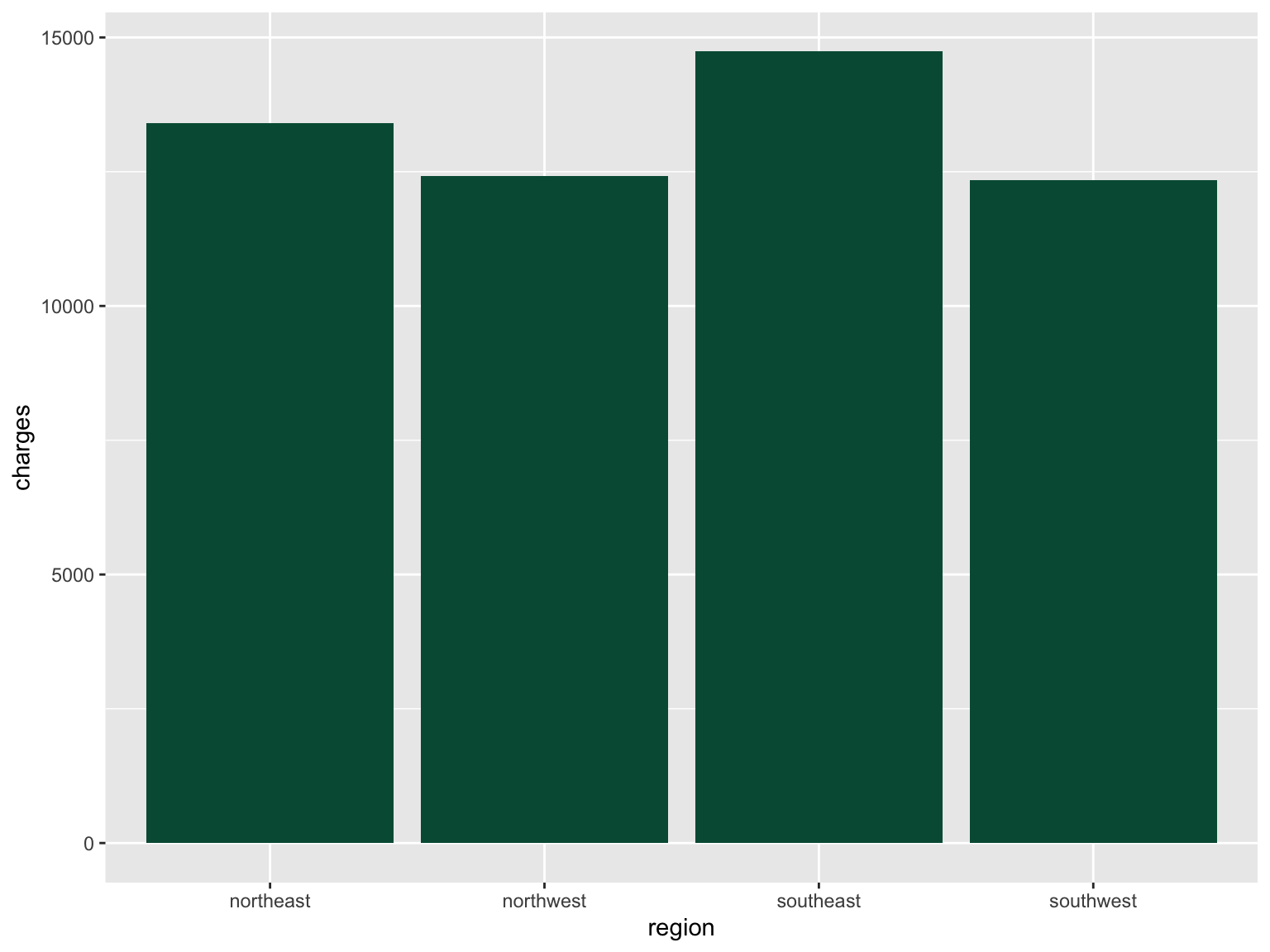
Resources🎨 Layer: Theme (color)
- Setting
fill = "#005a43"customizes bar colors
Step 5: Add labels and themes
plot1_charges_region_barplot <- ggplot(
  data = insurancedata,
  mapping = aes(
    x = region,
    y = charges)) +
  geom_bar(
    stat = 'summary', fun = 'mean', fill = "#005a43") +
  ggtitle("Mean Insurance Charges Based on Region") +
  xlab("Region") +
  ylab("Insurance Charges") +
  theme_bw()

plot1_charges_region_barplot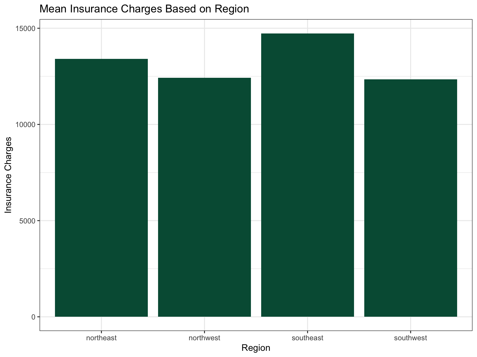
Resources🎨 Layer: Theme
- Theme: Labels and
theme_bw()enhance appearance
Violin Plots with geom_violin()
Violin plots provide a different way to visualize information to capture the distribution of data for each category.
ggplot(data = insurancedata,
       mapping = aes(
         x = smoker,
         y = charges,
         fill = smoker)) +
  geom_violin() +
  ggtitle("Distribution of Insurance Charges by Smoking Status") +
  xlab("Smoker (Y/N)") +
  ylab("Insurance Charges") +
  theme_bw()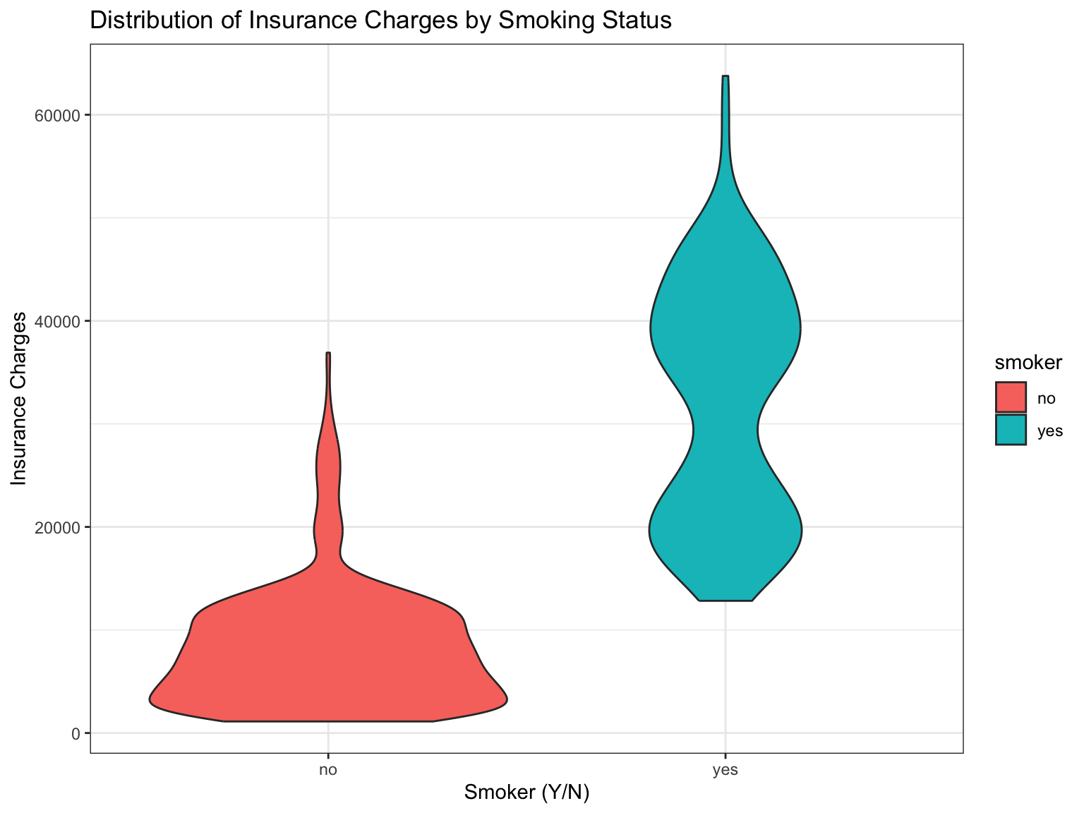
#plot above plot without using plot = argument
ggsave("plots/plot2_charges_smoker_violin.png",
       width = 8, height = 5, dpi = 300)
To learn more about how to use violin plots for pre/post data, see the chapter on visualizing pre/post scores.
GoGo: Save your plot with
ggsave()
Every plot in your RD Report and Final Report must be saved with ggsave(), so you can add it to your team poster. Save the plot to an object, then add two lines:
ggsave("plots/plot1_wellbeing_treated_barplot.png",
       plot = plot1_wellbeing_treated_barplot, width = 8, height = 5, dpi = 300)
The file name is the figure number, the variables, and the plot type. The full explanation is in Write the Results.
20.2.3 Play 2: Health status by racialized identity and sex (class dataset)
The insurance data showed the layers. This second play uses a dataset collected by FRI students, with the two things your own comparison plots will need: a rating scale as the outcome, and two grouping variables at once.
ResourcesAbout the dataset:
health_status_data.csv (the Cohort 10 class dataset)
Every FRI Public Health team in Cohort 10 asked the same self-rated health question, Would you say your health in general is excellent, very good, good, fair, or poor?, along with the class variables of that year (age, sex, racialized identity, perceived income, and the MacArthur ladder of subjective social status). The five team datasets were merged into one file of 343 respondents so that health status could be examined across the whole class. SAMPLE_ID says which team’s study a person came from.
This is real data, already cleaned and de-identified: no response IDs, passwords, dates, or open-ended answers, and the five team samples differ in whom they recruited (students, families, farmers-market visitors), which is why the chapters filter by age. The variable names predate the class naming rules, so the Play renames them: HEALTH_STATUS becomes HEALTHSTATUS (1 = Poor … 5 = Excellent); SSS is subjective social status (1 to 10); SEX is biological sex (0 = male, 1 = female); and RACIALIZED_IDENTITY (1 = identified as white only, 0 = any other identity) becomes MINORITIZED_01 (1 = minoritized, 0 = not), named for the 1 the way a _01 variable should be. The other columns (RG_…, RI_…, PoorFairHealth, ExcellentHealth) are earlier recodes of the same questions and are not used here.
The question. Does self-rated health differ between people who are minoritized and people who are not, and is that difference the same for male and female participants? Health status is a 1-to-5 rating treated as a continuous score, so the bar height is a mean.
library(dplyr)
healthstatusdata <- read.csv("data/health_status_data.csv")

healthstatusdata <- healthstatusdata |>
  rename(HEALTHSTATUS = HEALTH_STATUS) |>
  mutate(
    MINORITIZED_01 = if_else(RACIALIZED_IDENTITY == 1, 0, 1),          # 1 = minoritized (any identity other than white only)
    MINORITIZED    = factor(MINORITIZED_01, levels = c(0, 1), labels = c("Not minoritized", "Minoritized")),
    SEX            = factor(SEX, levels = c(0, 1), labels = c("Male", "Female")))

healthstatusdata_25 <- healthstatusdata |> filter(AGE >= 25)      # adults 25 and older: the teams' student samples skew 18 to 22

healthstatusdata_25 |>
  group_by(MINORITIZED, SEX) |>
  summarise(n = n(), mean_health = mean(HEALTHSTATUS), .groups = "drop")
# A tibble: 4 × 4
MINORITIZED SEX n mean_health
<fct> <fct> <int> <dbl>
1 Not minoritized Male 15 3.53
2 Not minoritized Female 75 3.55
3 Minoritized Male 10 3.1
4 Minoritized Female 22 3.36#source: Cohort 10 class dataset (five FRI Public Health teams, merged)
#explanation: rename to the class conventions, make the two grouping factors, keep respondents 25 and older, and print the n behind every bar before drawing itlibrary(ggplot2)
plot3_health_minoritized_sex_barplot <- ggplot(healthstatusdata_25,
aes(x = MINORITIZED, y = HEALTHSTATUS, fill = SEX)) +
geom_bar(stat = "summary", fun = "mean", position = position_dodge(width = 0.8), width = 0.7) +
stat_summary(fun.data = mean_se, geom = "errorbar",
position = position_dodge(width = 0.8), width = 0.2) +
scale_fill_manual(values = c("Male" = "#5b8db8", "Female" = "#e76f51")) +
scale_y_continuous(breaks = 1:5, limits = c(0, 5),
labels = c("Poor", "Fair", "Good", "Very Good", "Excellent")) +
labs(title = "Self-rated health by racialized identity and sex (age 25+)",
x = "Racialized identity", y = "Mean health status", fill = "Sex") +
theme_bw()
plot3_health_minoritized_sex_barplot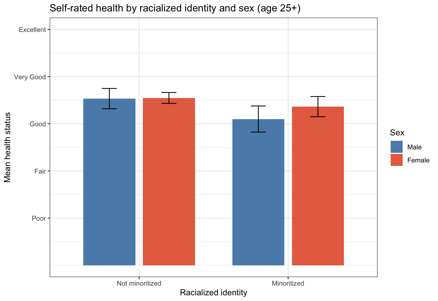
ggsave("plots/plot3_health_minoritized_sex_barplot.png", plot = plot3_health_minoritized_sex_barplot,
       width = 8, height = 5, dpi = 300)

#source: ggplot2 documentation https://ggplot2.tidyverse.org/reference/stat_summary.html
#explanation: x is the first group, fill is the second, position_dodge puts the bars side by side; stat_summary() adds a standard-error bar so the reader can see how sure each mean is
Two groups on the x axis and two in the fill is as many as a bar chart can carry. Read it in two passes: first across (is one racialized group higher than the other?), then within each pair (do male and female participants differ in the same way in both?). A difference that appears in one pair and not the other is an interaction, and Compare 3+ Groups is where it gets tested. Note the small cells: print the count() first, as above, and report every n in the caption or the text.
CautionCaution: a bar hides the spread
A bar chart of means shows four numbers and nothing else. Before you report one, look at the same comparison as a violin or a raincloud plot (Compare 2 Groups) so that you have seen the distributions behind the means, and give the error bars or the standard deviations in the text.
20.3 🏈 The Lab
You watched the play above with the insurancedata dataset (Pass 1). Now run two plays yourself with the lab dataset, a survey about what people believe about mental health.
Ref’s kickoff. This lab is not graded, so I am here to help you check your own work. Try each play before you open my check or the solution. If your answer does not match, that is not a penalty. It is how you find out what to fix.
| Lab play | What is new |
|---|---|
| Sweep Left | a barplot with the original groups |
| Sweep Right | transform the groups first, then make a better barplot |
Before you start
- Open your RStudio Project and your lab
.qmdfile. - Load the clean lab data by running this chunk. It runs the cleaning script you built in the earlier labs.
source("lab_prep.R")   # creates mh_clean
nrow(mh_clean)         # how many people are in the clean dataset?
Go Ref’s check: how many rows?
Ref’s check: how many rows?
nrow(mh_clean) should be 188. If you get 200, you are looking at the raw data: the duplicate response and the people who failed the attention checks have not been removed yet.
20.3.1 Lab Play 1: Sweep Left (a barplot with the original groups)
Research question: Does the belief that mental health is social (SOCIAL, 1 to 5) differ by political beliefs?
The survey asked: What label best captures your political beliefs? The answers are stored as numbers in POLITICALBELIEFS.
| Code | Label |
|---|---|
| 1 | Leftist |
| 2 | Liberal |
| 3 | Moderate |
| 4 | Conservative |
| 5 | Far Right/Alt-Right |
| 6 | Libertarian |
NA |
Prefer not to say (-99) or None of the above / Don’t know (-50), turned into missing in Import Data Once |
Your task, part 1: Look at the original data first. How many people chose each answer?
mh_clean |>
  count(POLITICALBELIEFS)
Your task, part 2: Give the numbers their labels with factor(), then go back to the barplot play and make a barplot of the mean of SOCIAL for every group.
mh_clean <- mh_clean |>
  mutate(POLITICALBELIEFS_f = factor(
    POLITICALBELIEFS,
    levels = c(1, 2, 3, 4, 5, 6),
    labels = c("Leftist", "Liberal", "Moderate", "Conservative",
               "Far Right/Alt-Right", "Libertarian")))
Go Ref’s check: how many people are behind each bar?
Ref’s check: how many people are behind each bar?
| Political label | n | Mean SOCIAL |
|---|---|---|
| Leftist | 23 | 4.28 |
| Liberal | 67 | 4.21 |
| Moderate | 26 | 4.13 |
| Conservative | 41 | 3.75 |
| Far Right/Alt-Right | 6 | 2.83 |
| Libertarian | 4 | 4.21 |
| NA | 21 | 4.05 |
- You should see seven bars: six labels and one labeled
NA. Your counts and bar heights should match the table. - Now be the referee of your own plot. The Libertarian bar is the average of only 4 people, so it tells you almost nothing about Libertarians. The
NAbar is the 21 people who chose “Prefer not to say” or “None of the above / Don’t know”: not a political group at all, andggplot2still draws a bar for it unless you take those rows out. Seven bars also make it hard to see the main pattern. Lab Play 2 fixes all three problems.
Resources👀 See the solution
plot4_social_politics_barplot <- ggplot(
  data = mh_clean,
  mapping = aes(
    x = POLITICALBELIEFS_f,
    y = SOCIAL)) +
  geom_bar(
    stat = 'summary', fun = 'mean', fill = "#005a43") +
  ylim(0, 5) +
  ggtitle("Mean SOCIAL Conception of Mental Health by Political Label (original groups)") +
  xlab("Political label") +
  ylab("Mental health is social (1 = disagree, 5 = agree)") +
  theme_bw() +
  theme(axis.text.x = element_text(angle = 30, hjust = 1))

print(plot4_social_politics_barplot)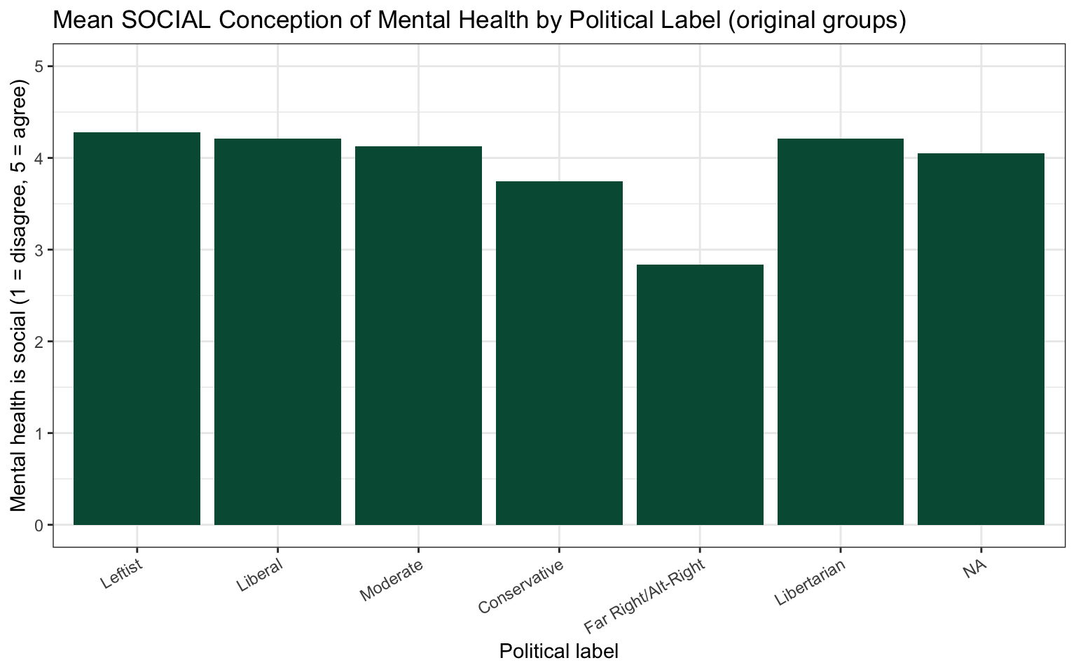
20.3.2 Lab Play 2: Sweep Right (transform the groups, then a barplot)
Researchers often combine small groups into larger ones and exclude answers that are not groups. This is a decision you make, so you must tell your reader exactly what you did.
Your task, part 1: Transform POLITICALBELIEFS into a new variable with three groups.
- Left = Leftist (1) or Liberal (2)
- Moderate = Moderate (3)
- Right = Conservative (4) or Far Right/Alt-Right (5)
- Exclude Libertarian (6) because only 4 people chose it. The
NAanswers (“Prefer not to say” and “None of the above or Don’t Know”) drop out on their own:case_when()givesNAto anything that matches no condition.
mh_clean <- mh_clean |>
  mutate(POL_3CAT = case_when(
    POLITICALBELIEFS %in% c(1, 2) ~ "Left",
    POLITICALBELIEFS == 3         ~ "Moderate",
    POLITICALBELIEFS %in% c(4, 5) ~ "Right"))   # every other answer becomes NA (missing)

# ALWAYS check a transformation: did every answer go where you wanted?
mh_clean |>
  count(POLITICALBELIEFS, POL_3CAT)

# keep only the people who are in one of the three groups
mh_3cat <- mh_clean |>
  filter(!is.na(POL_3CAT))
Your task, part 2: Make the barplot again with mh_3cat and POL_3CAT. Write a figure caption that tells the reader how the groups were made and how many people were excluded, with the counts.
Caution Foul:
Foul:
Foul: == 1 | 2 does not mean “1 or 2”
POLITICALBELIEFS == 1 | 2 looks right, but R reads it in a way that puts everyone in the first group. To say “is one of these values”, use %in%, like this: POLITICALBELIEFS %in% c(1, 2). The count(POLITICALBELIEFS, POL_3CAT) check will catch this foul for you.
Go Ref’s check: did your transformation work?
Ref’s check: did your transformation work?
| Political beliefs | n | Mean SOCIAL |
|---|---|---|
| Left | 90 | 4.23 |
| Moderate | 26 | 4.13 |
| Right | 47 | 3.63 |
mh_3catshould have 163 people. You excluded 25: 4 Libertarian and 21 who did not choose a label (NA).- You should see exactly three bars, and the counts and bar heights should match the table.
- Tallest bar: Left. Shortest bar: Right. The pattern is much easier to see with three bars than with eight. You will learn to test whether this difference is statistically significant later in this part of the playbook (Compare Groups).
Resources👀 See the solution
plot5_social_pol3cat_barplot <- ggplot(
  data = mh_3cat,
  mapping = aes(
    x = POL_3CAT,
    y = SOCIAL)) +
  geom_bar(
    stat = 'summary', fun = 'mean', fill = "#005a43") +
  ylim(0, 5) +
  ggtitle("Mean SOCIAL Conception of Mental Health by Political Beliefs") +
  xlab("Political beliefs") +
  ylab("Mental health is social (1 = disagree, 5 = agree)") +
  theme_bw()

print(plot5_social_pol3cat_barplot)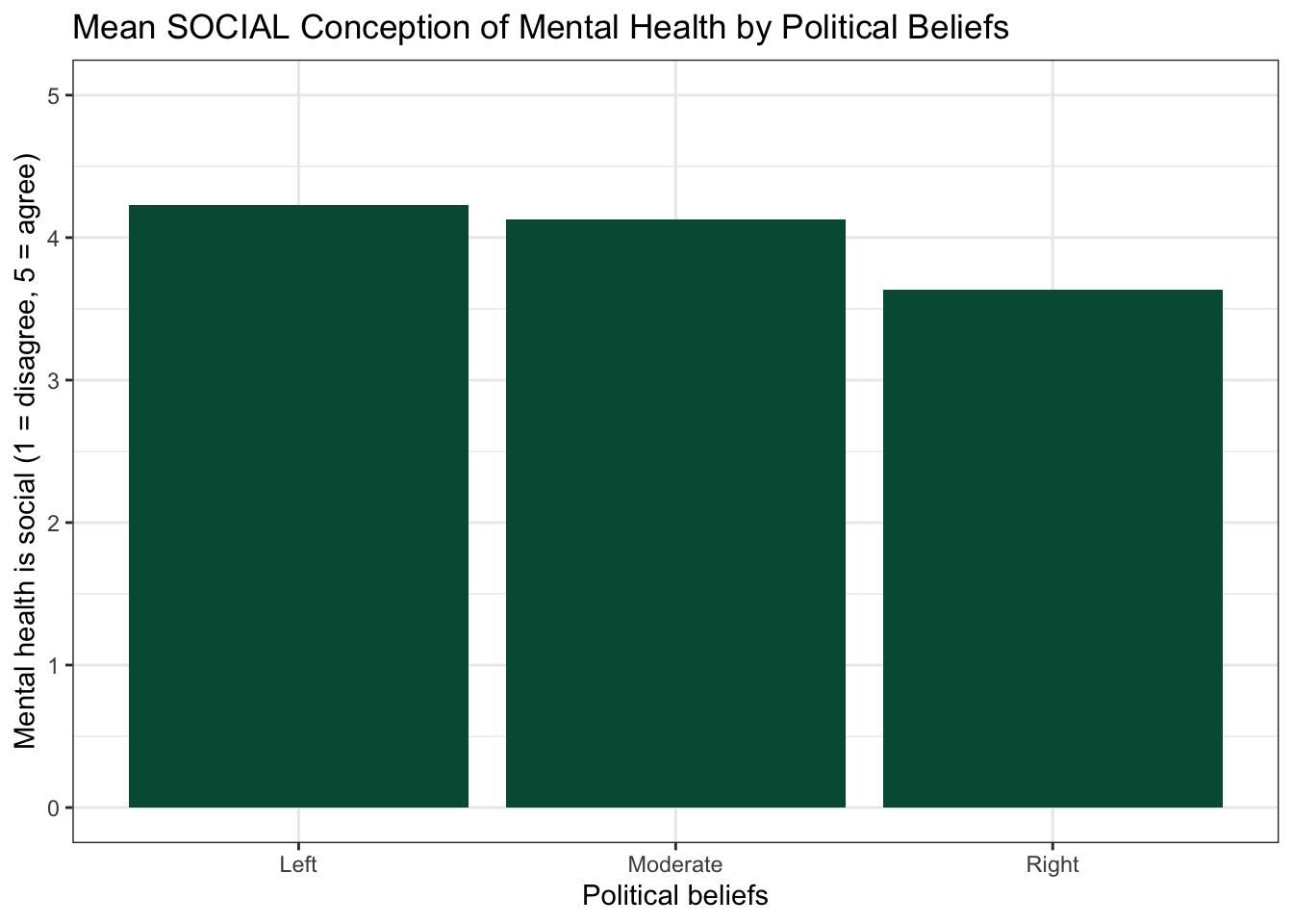
Caution Ref’s call: fouls to check if your plot does not match
Ref’s call: fouls to check if your plot does not match
- Bars in strange places with numbers on the x axis → you plotted
POLITICALBELIEFS(numbers). PlotPOLITICALBELIEFS_f(the factor with labels). - A bar labeled
NAin Lab Play 2 → you plottedmh_cleanwhen you meantmh_3cat, or you skipped thefilter(!is.na(POL_3CAT))step. - Everyone is in the “Left” group → you wrote
== 1 | 2. Use%in% c(1, 2). - An error that mentions
stat_count()→ you left outstat = 'summary', fun = 'mean'insidegeom_bar(). Without it,geom_bar()tries to count people when you want it to show each group’s average. object 'SOCIAL' not found→SOCIALis a composite created inlab_prep.R. Runsource("lab_prep.R")first.- An error that mentions
+→ each ggplot line must end with+. A line that starts with+breaks the plot.
Ref’s final whistle. That is the end of the lab. Save your .qmd, render it, and back up your .qmd and .R files to the R Labs folder in your ELN before you quit RStudio.
20.4 🏆 Your Turn
Once you finish all of the R Labs, come back here with your team’s dataset and make the plot for your comparison research question.
20.4.1 The comparison play
mydata <- cleandata |>              # alldata = your team's imported .cleandataset (Import Data Once)
  filter(!is.na(SWAPGROUP))                 # SWAP: your grouping variable

plot1_SWAPNAME <- ggplot(                    # SWAP: plot number + variables + plot type
  data = mydata,
  mapping = aes(
    x = SWAPGROUP,                          # SWAP: your grouping variable
    y = SWAPOUTCOME)) +                     # SWAP: your continuous outcome
  geom_bar(
    stat = 'summary', fun = 'mean', fill = "#005a43") +
  ggtitle("SWAP: your title") +
  xlab("SWAP: a plain-words label") +
  ylab("SWAP: a plain-words label and the scale range") +
  theme_bw()

print(plot1_SWAPNAME)
ggsave("plots/plot1_SWAPNAME.png",                # SWAP: the variables and plot type, e.g. plot1_wellbeing_treated_barplot
       plot = plot1_SWAPNAME,
       width = 8, height = 5, dpi = 300)
20.4.2 If you need to combine or exclude groups first
Do this before the comparison play above, then use your new dataset and your new grouping variable in the barplot.
alldata <- alldata |>                     # alldata = your team's imported .cleandataset (Import Data Once)
  mutate(SWAPNEWGROUP = case_when(          # SWAP: a name for your new variable (ends in _#CAT)
    SWAPGROUP %in% c(1, 2) ~ "SWAPLABEL1",  # SWAP: the codes and the label for group 1
    SWAPGROUP == 3         ~ "SWAPLABEL2",  # SWAP: the code and the label for group 2
    SWAPGROUP %in% c(4, 5) ~ "SWAPLABEL3"))# SWAP: the codes and the label for group 3
                                            # every answer you leave out becomes NA (missing)

cleandata |>
  count(SWAPGROUP, SWAPNEWGROUP)            # check: did every answer go where you wanted?

mydata <- cleandata |>
  filter(!is.na(NEWGROUP))                  # keep only people who are in one of your groups
In your figure caption, tell the reader which answers you combined, which answers you excluded, and how many people were excluded (for example, “Excluded: Libertarian (n = 4)”).
20.4.3 Checklist for your RD Report and Final Report
ResourcesOpen the plot checklist
| Criteria | Ask yourself |
|---|---|
| Data and mapping | Is the cleaned dataset used, with the correct variables on x and y? |
| Geometry | Is this the best plot for the data (e.g., scatterplot for two continuous variables; barplot or boxplot for groups)? |
| Stacked points | If points sit on top of each other, are they jittered, and does the caption say so? |
| Groups | Were very small groups combined or excluded? Does the caption say what was combined or excluded, with the counts? |
| Stats | Is there a line of best fit on a scatterplot? Are there error bars on a barplot? (Error bars are required in the Final Report, not the RD Report.) |
| Axes and labels | Are both axes labeled in plain words (not variable names)? Does each axis cover the full range of the scale? |
| Facets | Would a facet (one panel per group) help answer your research question? |
| Appearance | Is there an accurate title? Is a non-default theme used (the same theme in every plot)? Does color add meaning? |
| Code formatting | Can you read the code without scrolling to the right? Does the plot print without errors or extra output? |
| Figure caption | Does the chunk have fig-cap, starting with “Figure 1.”, “Figure 2.”, and enough detail to stand alone? |
| Alt text | Does the chunk have fig-alt that describes what the plot shows? |
| ggsave( ) | Is the plot saved with ggsave() into the plots folder of your RStudio Project, named plot#_variables_type.png (for example plot1_wellbeing_treated_barplot.png), with the object named the same? |
| Stands alone | Could a reader understand the figure without reading your text? |
| Referenced in text | Does your results paragraph point to it (e.g., “Figure 1 shows the association between …”)? |
Resources Ref’s final whistle: before you quit RStudio
Ref’s final whistle: before you quit RStudio
Save → Render → Back up to ELN → Quit, Don’t Save workspace. Details: Ref’s Quick Checklist.